Decoding the Olympic Ring: The Ultimate Symbol’s Meaning & What’s Next for LA28
Ever since my childhood days, we’ve treated the Olympics like the ultimate global festival that only drops every four years. It’s the biggest vibe check in the world—a stage where the literal GOATs of sports battle it out, and every athlete dreams of that ultimate podium flex. But even though the Games are basically ancient history at this point, there’s one thing that has lived rent-free in my head since day one: what on earth do those circles actually mean? Let’s decode the mystery behind the Olympic Ring symbol and see how it’s evolving for the future.
Spilling the Tea on the Origin
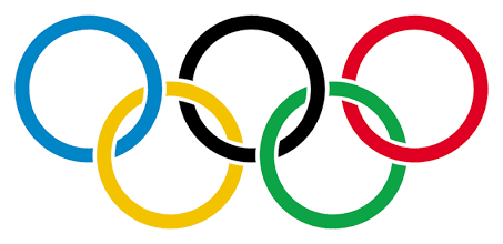
The modern Olympic Games were spearheaded by a French historian and educator named Pierre de Coubertin. Back in 1913, he had a massive brainwave. He needed a symbol that would visually represent both the spirit of the Games and the global reach of the Olympic Movement.
Coubertin sketched the first Olympic Ring design by hand—five interlocking circles set against a stark white background. They made their official debut a few years later, flying high on a flag at the 1920 Antwerp Games in Belgium.
What Does the Olympic Ring Actually Mean?
The design isn’t just about looking cool; every element carries major weight. According to the International Olympic Committee (IOC), here is the real flex behind the symbol:
- The Five Continents: The five interlocking rings represent the union of the five inhabited regions of the world that show up to compete: Africa, the Americas (considered a single continent here), Asia, Europe, and Oceania.
- The Colors: The rings always roll deep in a specific order from left to right: blue, yellow, black, green, and red.
- Myth Busting the Colors (No Cap): There’s a persistent myth that each color matches a specific continent. That is pure cap. The real story is way more big-brain: Coubertin chose those five specific colors, plus the white background, because at least one of those six colors appeared on every single national flag in the world at the time.
The flawless, interwoven design of the Olympic Ring is all about giving global unity. It’s a visual reminder of Coubertin’s ultimate goal: athletes from all over the planet meeting as equals in a peaceful, intense rivalry.
Main Character Energy: The LA28 Olympic Emblem
While the traditional Olympic Ring remains the undeniable anchor of the Games, host cities get to create their own unique logo. For the upcoming Los Angeles 2028 Games, organizers totally understood the assignment, ditching static tradition for a radically modern approach.

Instead of a single, unchangeable monument, the LA28 emblem is built specifically for the digital age. Here’s why it’s bringing pure main character energy to the global stage:
- Defying Singular Identity: The LA28 logo features a bold, static “L”, “2”, and “8”. However, the “A” in “LA” is constantly shapeshifting. Organizers knew that no single logo could capture the infinite stories, cultures, and hustle of Los Angeles.
- Co-Creation: To launch the emblem, more than 20 unique versions of the “A” were co-created by a diverse crew of athletes, artists, and community members.
- A Living Canvas: The dynamic emblem serves as a platform for self-expression, highlighting individual voices and stories rather than just acting as a corporate stamp.
By pairing the historic, unifying weight of the 1913 Olympic Ring with the highly individualized, ever-changing LA28 emblem, the upcoming Games are signaling a major shift. The Olympics aren’t just about nations coming together anymore; they are becoming a platform that hypes up the diverse, individual voices that make up our global community.